-
CUSTOMER
Stefan Lindblad -
PROFESSION
Freelance illustrator, graphic designer and artist -
LOCATION
Stockholm, Sweden -
PRODUCT
CorelDRAW Graphics Suite
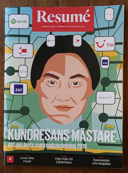
Resumé, Scandinavia's largest business newspaper on advertising, media, news, marketing, PR and events, approached Stefan to create two illustrations for their June 2019 issue. Though it was not Stefan’s first time working with publishing houses on magazine features, he jumped at the opportunity to have his work represented on the cover of this widely circulated magazine.
In today’s digital world, it’s cool to see your work on display at a store, or lying on a coffee table. It's tangible.
Designing to the details
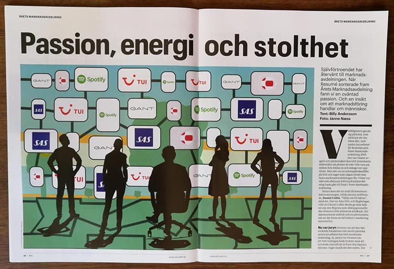
The two commissioned illustrations were to complement the magazine's award for Best Swedish Marketing Division. There were five well-known companies in the final, all of which had marketing teams that were experts in data-driven marketing and customer centricity. Other common traits of the finalists were their ability to work closely with other business units, such as sales, product development and customer service, as well as their strong focus on awareness of social and environmental issues.
Collecting this level of detail was incredibly important in inspiring Stefan’s design concept.
The recipe that brought this all to life was a mixture of information gathering, analyzing, my imagination, sketching and CorelDRAW.
After careful consideration, Stefan started designing shapes resembling monitors and including the finalist logos within them. As people were at the heart of the awards, he chose to feature a face on the cover, looking at the reader. He tied it all together with a color palette made of light blues, greens and yellows.
The double-page spread’s theme was consistent with the cover design, but instead of a portrait, Stefan drew silhouettes to represent a marketing division, staring at a web of brands in the background, as if they’re analyzing customer data coming in.

Client collaboration and CorelDRAW

The Resumé team provided Stefan with a PDF template for the cover with mastheads and other layout elements already in place. He worked on his illustration in a different layer in the Objects docker, toggling on and off the visibility of the other layers and objects to ensure the background illustration he was building sat nicely with the templated cover elements.
When the illustration was complete, Stefan exported his work to a TIFF file, and sent it off to the client. CorelDRAW’s extensive file compatibility is just one of the reasons Stefan chooses CorelDRAW Graphics Suite — knowing he can receive and work with any kind of project asset from a client, and export the final output to their preferred file format.
CorelDRAW is a very powerful tool for layout design. Having vector illustration and layout tools in one application is a huge timesaver, as is direct integration with Corel PHOTO-PAINT for working with images in a composition.
The right tools for the job
The three CorelDRAW tools integral to this magazine project were the Freehand tool, PowerClip objects and frames, and shapes.
Freehand tool
Naturally as an illustrator, Stefan uses the Freehand tool extensively in all his work, as it lets him draw freehand lines as if he were sketching on a sketchpad. It also lets him control the smoothness of the curved lines he draws, and add and manipulate segments. The Freehand tool was the most used tool in creating both the cover and double-page spread illustrations.
PowerClip
CorelDRAW’s PowerClip tool allows you to place vector objects and bitmaps inside other objects (or frames). Stefan used PowerClip to trim his artwork to a specific shape and size, ensuring all elements of his illustration were constrained inside the boundaries of the cover and the double-page spread.
Shapes
CorelDRAW has a wide variety of tools for drawing and manipulating shapes. Stefan relied on these tools in building these compositions that heavily featured both simple and more complex shapes.
There are many other CorelDRAW tools that I use regularly, especially in layout projects, like fonts for example. CorelDRAW Graphics Suite has a wide variety of font tools and a powerful Font Manager application that makes working with type and fonts a breeze.
More about Stefan’s design and layout work
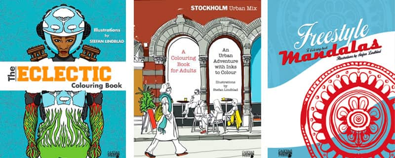
With Stefan’s clients being primarily news and advertising media, book publishers and corporations, he’s no stranger to seeing his illustrations, design and layout work published in a number of places. CorelDRAW Graphics Suite is his graphic design software suite of choice for all projects big or small, and he’ll often incorporate Corel Painter into his workflow to add a painterly look to his CorelDRAW designs. From 2016-2018 Stefan self-published three adult coloring books, which he illustrated and laid out entirely on his own, using only CorelDRAW Graphics Suite and Corel Painter.

CorelDRAW is excellent for laying out multi-page documents. Not all design applications have support for pages that allow you to layout enormous projects like a book for example, all in one document. You can create up to 999 pages!
Check out some of Stefan’s book covers and poster illustrations here
See a walkthrough of one of Stefan’s coloring books here

If you want to try your hand at illustration, page layout, or even crafting your own coloring book, download your own free trial of CorelDRAW Graphics Suite.
