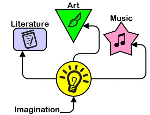

Whether you're trying to spice up your blog post or promote your business, infographics can be effective attention-grabbers. But how can you present information in a visually pleasing way with limited space? Infographics are great tools to help visualize an idea or thought, but it can be easy to lose their effectiveness if you make simple mistakes.
Below, we'll discuss infographic design and how to create an infographic that perfectly visualizes your content.
Infographic design is essentially the act of creating a visual representation of information. An effective infographic converts loads of information into small chunks of text and pleasing visuals in a way that's easy to understand. Ineffective infographics can skew and obscure information, rather than make it easier to understand. That's why it's so important to thoughtfully plan out your infographic design and follow some infographic design best practices.
Download a Free 15-Day Trial Now!
Look at examples of effective infographics already on the web. This will give you infographic design inspiration that will show you what good infographics look like. However, don't copy these infographic ideas exactly. Just use them as a guide and make them your own.
Be sure to go through your information and find the most important points. Then, include these key points in your infographic. For increased readability, you can use lines and icons. That way, if you have complex information, smart organization can make it easier for your readers to digest.
If your infographic will include lots of data, it's important to find the best way to visualize that data. Depending on the type of data your infographic will present, choose the best chart type. If you're looking to compare data, using a column graph is one of the easiest ways to do so. Use a line chart to convey a trend over time. These are just general guidelines, but you can get creative and use a more unusual chart to display your data effectively, Just make sure your charts are easy to read and understand.
The way you break down your information is a vital part of an effective graphic design infographic. But how you present this information is just as important. Font, colors, and visuals are key components of a beautiful infographic.
Refrain from filling every inch of your infographic with text and visuals. Leave some negative space between lines of text to give readers breathing room to process your information.
When it comes to designing infographics, you won't become a pro overnight. Designing an outstanding infographic takes tons of practice as well as trial and error.
Download a Free 15-Day Trial Now!