
Marcin Wilczynski
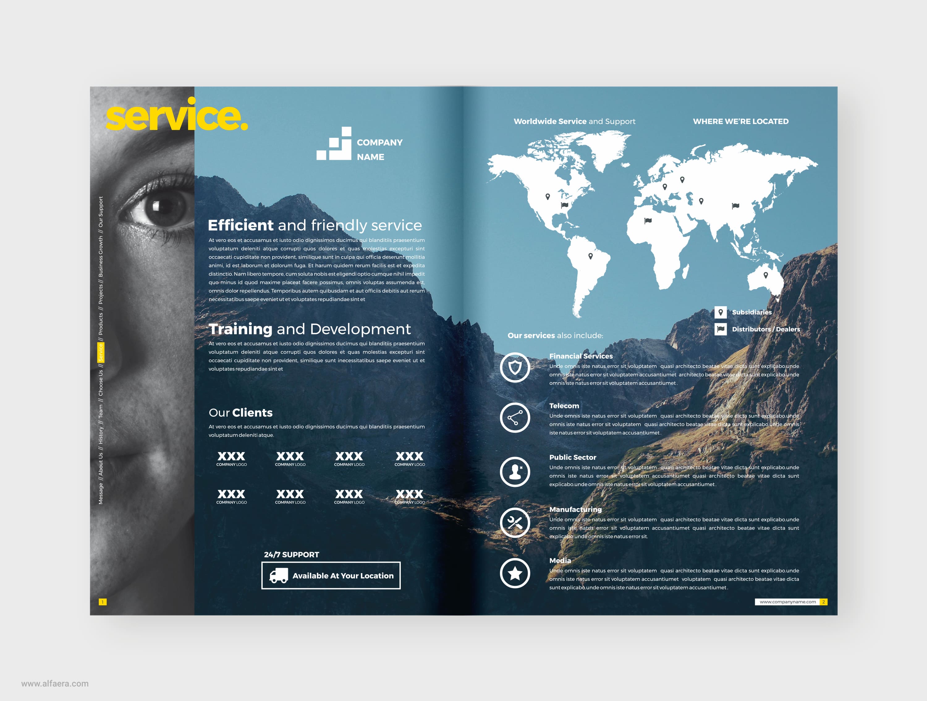
Magazine page layout is important if you want your publication to have a professional and reader-friendly design. There are quite a few factors to consider when putting together a magazine, whether you're planning a print or digital magazine (or both). After selecting all of your content, you need to plan magazine page size and other elements.
A magazine starts with engaging content such as articles and images. To really connect with readers, though, you need to pay close attention to magazine page design. The appearance and layout of the magazine is largely what draws people in or turns them off. This includes:
Download a Free 15-Day Trial Now!
Let's look at the important steps involved in the magazine page layout.
In the past, designers had to do everything by hand. Today, you have numerous software tools that make your work much easier. You can find a variety of free and paid tools that help you with things such as a magazine page template, illustrations, layout, photo editing, and more. CorelDRAW is a suite of software programs that are useful for every stage of magazine page design.
Decide what articles and images you want to include in the current issue. You may need to modify these choices later on due to space restrictions or layout issues. A magazine creator needs to pay particular attention to certain elements that readers immediately notice. These include:
The layout grid is the basic pattern on which your magazine (or anything being designed) uses. It consists of a certain number of columns in various positions. The simplest way to start your project is to use a magazine page template. Design tools typically offer you a variety of choices with different grids. You can also design your own custom templates.
You also need to choose your typography style and color palette. It's usually best to keep it simple. Using too many font styles, font sizes, and colors can give your finished product a confusing and amateurish look.
Upload images you want to use into the graphic design program you're using. Don't forget backgrounds as well. Position articles and images on the page. Add elements such as shapes and colors. Magazine layout is about creating a harmonious relationship between text, images, and white space. If you use a graphic design tool such as CorelDRAW, you'll find it simple to drag and drop elements into place and make edits as necessary. You may have to move elements around to get the desired look. Don't be afraid to experiment with different fonts, colors, and shapes. Move things around on the page to see if you can make improvements.
If your magazine is going to be printed, you need to make decisions that will affect the printing, such as the type of paper you print on. Use high-quality glossy paper makes the magazine look more appealing. You'll also need to calculate trim, bleed, and live area dimensions in order to ensure that the pages turn out looking good with everything visible.
No matter how great your material is, you won't attract readers without impressive and professional magazine page design. Whether people are accessing your magazine in print or online, they want to see copy and images that are easy for the eyes to follow and that are arranged in a way that's appealing and easy to follow. Find a style that's reader-friendly as well as true to your topic and brand.
Download a Free 15-Day Trial Now!